Dry Materials 2: Colored Pencils, Soft/Chalk Pastels, and Oil Pastels
- Caroline Harding

- Nov 16, 2023
- 19 min read
Colored Pencils

Adjectives
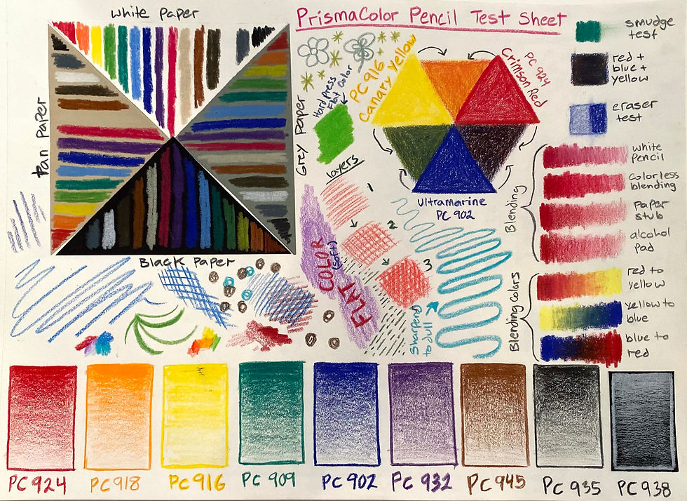
Bright, smooth, vibrant, layer-able, controlled, resistant, waxy, strong, colorful, detailed
Supporting materials :
Sharpener for pencils (an alternative can be an x-acto knife, but it is more dangerous for students)
Colorless pencil blender
Alcohol pads
Sandpaper to sharpen pigmented core
Blending stumps and tortillions
Paper towels
Erasers (plastic or vinyl)
Different brands and types:
Prismacolor pencils https://www.dickblick.com/products/prismacolor-premier-colored-pencils/
Caran d'Ache Luminance Colored Pencils https://www.dickblick.com/products/caran-dache-luminance-colored-pencils/
Crayola Colored Pencils https://www.dickblick.com/products/crayola-colored-pencils/
Derwent Lightfast Colored Pencils and Sets https://www.dickblick.com/products/derwent-lightfast-colored-pencils/
Stabilo Woody 3 in 1 Pencils and Sets https://www.dickblick.com/products/stabilo-woody-3-in-1-pencils/
Faber Castell World Colors EcoPencil Colored Pencil Sets https://www.dickblick.com/products/faber-castell-world-colors-ecopencil-colored-pencil-sets/
Prismacolor Scholar Art Pencil Sets https://www.dickblick.com/products/prismacolor-scholar-art-pencil-sets/
Koh-I-Noor Progresso Woodless Colored Pencils and Sets https://www.dickblick.com/products/koh-i-noor-progresso-woodless-colored-pencils/?fromSearch=%2Fsearch%2F
Experimentation

Notes:
Colored pencils are essentially the colored version of graphite pencils. This medium is very durable and easily able to be controlled to achieve a desired effect. Colored pencils also work very well on multiple different types of paper to great effect. Overall, it is an excellent material to use to achieve fine details. Many of the techniques I tested out in class work wonderfully with the colored pencils, including stippling and hatching. I found that colored pencils can also be easily used to achieve a gradient of colors and values. Due to this medium's layer ability, one can make a plethora of different colors. However, at a certain point, the wax will build up, and you can no longer successfully add layers of color. Additionally, it can be hard to completely erase a color once you put it down. Therefore, it’s a go idea to start with your lightest values and slowly build up darker areas. After researching this medium, I learned that there are a few different types of colored pencils including different sizes and variations with a wood casing or without. Overall, this medium is very dependable; however, it does take a while to fill large spaces, which should be considered when developing lesson projects.
Safety/health considerations
Colored pencils are not considered a safety hazard to children. While they may contain small amounts of pigment, the amount is too small to cause any issues. As with any pointy tools, young children need to be supervised to ensure they use the tools as intended. If a pencil accidentally punctures the skin, the best course of action is to send the student to the nurse to have the wound cleaned and checked out. Additionally, it is best practice to have children wash their hands after using the material to remove any residue from their skin to prevent any harm.
Data Safety sheet for Prisma colored pencils: https://www.dick-blick.com/msds/DBH_SDS_20508XXXX.pdf
Project ideas
Botanical illustration project

This is a series of images that show different stages of progress of completion for an 18 x 24 in. colored pencil drawing I created this semester for my botanical illustration class.
For this project, the teacher could team up with the science teacher at a school to create a lesson centered around learning the anatomy of a plant or flower. Students could learn about scientific illustrators as a possible career path as well as become more familiar with the different components of a plant. Some specific ideas include drawing a dissected flower or drawing two different groups of leaves that grow in different patterns (for example, alternative and opposite leaf growth patterns).
Accommodation possibilities :
Pencil grips for students working on their grip strength and fine motor skills
Woodless pencils can be given to students who struggle with using a sharpener, and they can also give students more surface area to create marks with
Some colored pencils have a textured grip on the wood casing to help them grip more easier
Different sized materials to give students the ability to pick what works best for them
Appropriate age group and behavioral expectations
Colored pencils are an accessible and appropriate medium for students of all ages to engage with. Younger and more inexperienced students would do best with a limited color pallet so that they are forced to explore the medium more in-depth to create their own desired hue by color mixing. Younger students may also need help sharpening the pencils, which might be able to be alleviated by having access to an electric sharpener or using woodless pencils. I would also recommend giving younger students a cheaper brand like Crayola, which is still a high-quality colored pencil brand for them to begin using.
Artist resources
Lui Ferreyra
Denver-based artist Lui Ferreyra utilizes color, shape, and line to create striking modern portraits that reflect “today's labyrinthine digital age.” His impressive portfolio features a mix of traditional pieces made with colored pencils, as well as some that are drawn digitally. Regardless of the medium, however, Ferreyra uses the same distinct style to render his subjects. This requires him to fill in faces with bold blocks of color and add numerous hatch marks in varying directions. As a result of this layered effect, the subjects look as though they are seen through a filter.

“Eternal Recurrence Study,” by Lui Ferreyra, N.D. Color-pencil on Paper, 16 x 12 in.

“Idioma 5,” by Lui Ferreyra, N.D. Color Pencil on Paper, 10 x 10 in.

“Psyche (Study),” by Lui Ferreyra, N.D. Color Pencil on Paper, 26 x 17.5 in.
Susan Rubin
Susan Rubin is a botanical artist with a contemporary point of view. In her work, she explores the botanical realm with an eye for scientific accuracy and a storytelling aesthetic. Bridging the space between traditional botanical illustration and modern materials, she draws connections between people and plants in colored pencil and mixed media.

“Papaver somniferum, Poppy: Western Mediterranean” by Susan Rubin, 2008. Color Pencil on Paper, 16 X 20 in.

“Living Color,” by Susan Rubin, 2021. Color Pencil on Paper, 18 x 18 in.
Soft/Chalk Pastels

Adjectives
Rough, loose, chalky, dusty, colorful, light, messy, vibrant, layer-able, fragile, fleeting
Supporting materials :
Paper towels
Blending stumps and tortillions
Erasers (plastic or vinyl)
Handheld or electric sharpener for pastel pencils (an alternative can be an x-acto knife, but it is more dangerous for students)
Sandpaper to sharpen pigmented core
Fixative spray
Gloves
Different brands and types:
Sennelier Soft Pastels and Sets https://www.dickblick.com/products/sennelier-soft-pastels/
Prismacolor NuPastel Color Sticks and Sets https://www.dickblick.com/products/prismacolor-nupastel-color-sticks/?fromSearch=%2Fsearch%2F%3Fsearchword%3Dprismacolor%20pastels
PanPastel Artists' Painting Pastels https://www.dickblick.com/products/panpastel-artists-painting-pastels/
Sargent Art Square Chalk Pastel Sets https://www.dickblick.com/products/sargent-art-square-chalk-pastels/
Blick Studio Pastel Sets https://www.dickblick.com/products/blick-pastels/
Stabilo CarbOthello Pastel Pencils and Sets https://www.dickblick.com/products/stabilo-carbothello-pastel-pencils/
Derwent Pastel Pencils and Sets https://www.dickblick.com/products/derwent-pastel-pencils/
Experimentation


Notes:
If colored pencils are the colored equivalent of graphite, then chalk pastels are the colored equivalent of charcoal. This medium is very loose, rough, and messy. The marks created with chalk pastels are very textured initially, which I think is interesting to explore. They can be smoothed out through heavy layering or by using a paper blending tool if desired. One strength of this medium is it is very quick and can be used to put down large areas of color in a short period of time. In return, chalk pastels can be a little unpredictable, and it is more difficult to get the same precision details that you can get with colored pencils. However, like colored pencils, this medium works extremely well on other colored and toned papers, even better because of its opaquer pigment. Overall, it is important to note that art created with chalk pastels can be easily smudged and changed if anything touches the surface of the drawing. Because of this and the excess dust build-up from using this material, it can also be extremely messy.
Other examples:
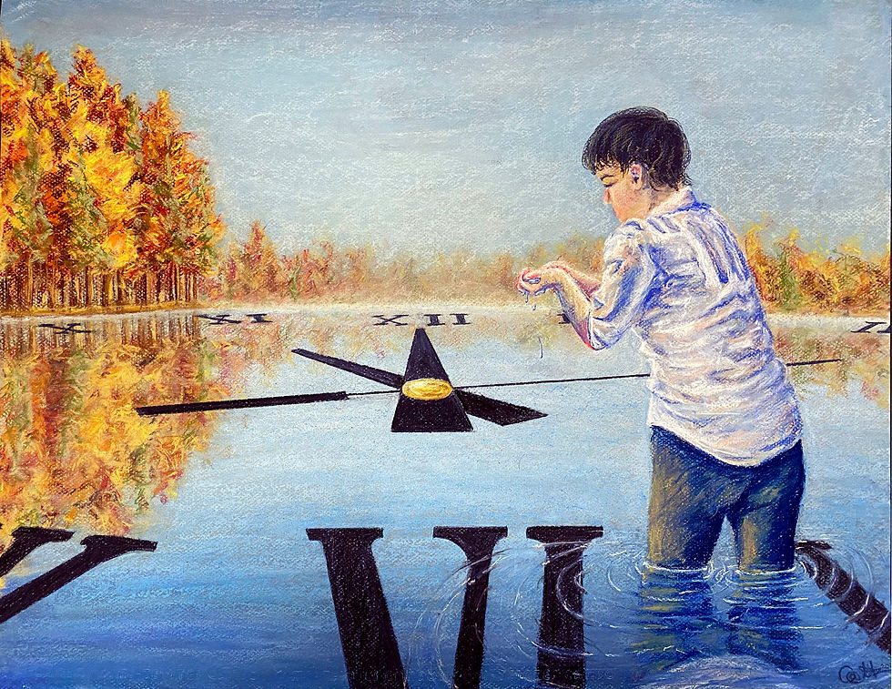
This is an 18 x 24 in chalk pastel drawing that I completed recently as part of a project for one of my drawing classes. This was created using mostly pastel sticks on dark-blue-toned paper as well as some pastel pencils for smaller detailed work. I used a scrap piece of paper to help make straight clean lines on the clock.
Safety/health considerations

Most soft or chalk pastels are safe to use; however, some create more dust than others which may pose problems for anyone with respiratory problems. Furthermore, some may contain toxic or suspected carcinogenic pigments such as chrome yellow. Care should be taken when selecting soft or chalk pastels to avoid potentially toxic colors, and masks should be used if the pastels create noticeable airborne dust. Blowing excess dust off of a drawing is one major source of charcoal inhalation and should be avoided. Additionally, it is best practice to have children wash their hands after using the material to remove any residue from their skin to prevent any harm. The room should also be cleaned up regularly to prevent charcoal dust build-up when working with the medium. Fixative spray is an additional material that can be used with the medium to help prevent smudging. However, both permanent and workable spray fixatives contain toxic solvents and are sometimes composed of plastic particulates. To prevent exposure to these solvents' smudging particulates by inhalation, have the sprayer use the spray outside to prevent toxic fume inhalation and build-up.
Data Safety sheet for Sargent Art square chalk pastels: https://cdn.dick-blick.com/msds/DBH_SDS_21930XXXX.pdf
Project ideas
Impressionistic drawing

This is an 18 x 24 in drawing that I created a while ago for a drawing class using charcoal and chalk pastels. The side that has chalk pastels is a good example of how they can be used to create an impressionistic style.
This project aims to complement chalk pastels' loose and impressionist qualities by creating a work engaged with impressionism. For this project, I would have students look at works by artists such as Vincent van Gough and Georges Seurat's "A Sunday Afternoon on the Island of La Grande Jatte" to look at how color can be put next to each other to create the illusion of a third color. I would give students a limited color pallet, blue, red, yellow, white, and a dark blue, purple, or black (and possibly let them pick one additional color of their choice) and then ask them to either create a self-portrait or scene with one or more other people using only those colors in an impressionist style.
Accommodation possibilities :
Pencil grips to put on pastel pencils for students working on their grip strength and fine motor skills
Softcore chalk pastels for students with a weaker grip strength
Sticks instead of pencils to help give students a bigger space to hold the material
Different sized materials to give students the ability to pick what works best for them
Gloves for students with sensory issues
Artist resources
Georgia O'Keeffe
Born in 1887, Georgia O'Keeffe was an American artist who painted nature in a way that showed how it made her feel. She is best known for her paintings of flowers and desert landscapes. She played an important part in the development of modern art in America, becoming the first female painter to gain respect in New York's art world in the 1920s. Her unique and new way of painting nature, simplifying its shapes and forms, meant that she was called a pioneer.
Teaching resources: https://www.tate.org.uk/kids/explore/who-is/who-georgia-okeeffe

“Water Lily,” by Georgia O’Keeffe, 1921. Pastel on paper, 28 1/4 x 17 1/2 in.

“A Storm,” by Georgia O’Keeffe, 1922. Pastel on paper, 18 1/4 x 24 3/8 in.
Zaria Forman
Zaria Forman is an artist who spreads awareness of climate change through her pastel drawings. She travels to remote regions of the world to collect images and inspiration for her work, just like her mother to find subjects for her photography.

“Perito Moreno Glacier, Argentina No. 1, December 13th 2018,” by Zaria Forman, 2020. soft pastel on paper, 68 x 102 in.

“Greenland no.41,” by Zaria Forman, 2007. Soft Pastel on Paper, 25"x25".
Oil Pastels

Adjectives
Buttery, smooth, soft, textured, rough, oily, smudgy, sticky, colorful, vibrant, stubborn, shinny
Supporting materials :
Paper towels
Blending stumps and tortillions
Erasers (plastic or vinyl)
Scratching material such as a toothpick or paper clip
Fixative spray
Hair Drier
Pallet Knife
Linseed oil (oil medium) and brush
Different brands and types:
Sennelier Oil Pastels and Sets https://www.dickblick.com/products/sennelier-oil-pastels/
Portfolio Series Watersoluble Oil Pastels https://www.dickblick.com/products/portfolio-series-watersoluble-oil-pastels/
Caran d'Ache Neocolor II Aquarelle Artists' Pastels and Sets https://www.dickblick.com/products/caran-dache-neocolor-ii-artists-crayons/
Sakura Cray-Pas Junior Artist Oil Pastel Sets https://www.dickblick.com/products/sakura-cray-pas-junior-artist-oil-pastels/
Crayola Oil Pastels https://www.dickblick.com/products/crayola-oil-pastels/
Experimentation


Notes:
Oil pastels remind me of oil paint, just in a dryer, safer, stick form. Similar to chalk pastels, this material is hard to control and get small precision details with. It is also extremely easy to smudge accidentally. One thing to note about oil pastels is that once a color gets put down, it is very hard to erase. Additionally, if you want to put down a light color, such as yellow, it is also very difficult to get one to cover a darker hue. However, these colors do layer and blend very nicely together. At a certain point, there will be too much build-up to add any more colors on top, but you can scrape off the colors to reveal the hue underneath. It is also fairly easy to get consistent flat coverage if pressed hard enough. Lastly, oil pastels come in many different sizes, including small to large. Some brands, like Sennelier, are very soft and buttery, while other brands, like Cray-Pas, are stiffer. Additionally, there are brands such as Portfolio Series Watersoluble Oil Pastels that can be mixed with water to create new marks or blended areas.
Other works:

This is a piece that I created in high school that used oil pastels. I was able to use a couple of different techniques in this piece, including using a scrap piece of paper to make straight lines. Additionally, to create the grass, I put down a light green, layered a darker green on top, and then scraped off sections of that dark green to reveal the lighter hue underneath.
Safety/health considerations
Most oil pastels are non-toxic and do not pose an inhalation risk. However, some colors may contain a toxic pigment that is cause for concern if ingested. Very young children should not use oil pastels, as they tend to put things in their mouths. According to the data safety sheet for Crayola Portfolio oil pastels: a poison control center should be called if someone does ingest the oil pastels. Outside of ingestion, oil pastels are usually safe for children to use. All but one of the brands I tested for this blog have The Art, and Creative Materials Institute (ACMI) Approved Product (AP) seal, meaning they are non-toxic. The outlier was my Sennelier oil pastels, which are rated Cautionary Labeling (CL) due to the possibility that they hold toxic minerals such as cadmium in their formula. This means the Sennelier oil pastels should not be used by students below grade 6 and with extreme caution with older students.
Data Safety sheet for Sakura CrayPas Junior Artist oil pastels: https://www2.pcad.edu/Facilities/health_safety/SDS/Youth%20Studios/sakura%20cray-pas%20junior%20oil%20pastels.pdf
Project ideas
Hand-made scratchboard

This project is something that I did with a group of CAT B Special education students in an adapted art and design studio class when I was a long-term sub at Irving middle school. For this project, we used oil pastels to create a colorful base layer filled with shapes. The shape design helped the students color the whole space without getting bored, and they were able to pick their own colors. Then, we put on a coat of acrylic soap-based layer to crate the black surface that you see on the paper. After these papers dried, I gave them a prompt, "Imaginary Garden," and let them create a work of art by scratching through the black layer to reveal what was underneath. While working on this project, we focused on learning about different types of lines and how texture can be made with them.
Accommodation possibilities :
Softer oil pastels for students with weaker grip strength or harder oil pastels for students with less control of their grip strength so they don’t break as easily
Thicker and larger oil pastels to help give students a bigger space to hold the material
Gloves for students with sensory issues
Different sized materials to give students the ability to pick what works best for them
Appropriate age group and behavioral expectations
I believe that oil pastels are best suited to middle and high school students. After conducting this study, I find that I would worry that young students wouldn't be able to control the medium and would make lots of messes by smudging the material everywhere on their paper, drawing on other sources, or spreading the material all over themselves. Furthermore, I would be concerned with younger students consuming the material and getting sick. Furthermore, I feel like the same effects can be achieved using crayons, which is a much safer and less messy alternative to oil pastels. However, I do think that it can be beneficial to introduce the medium to older elementary students (grade 3 or 4 and up) to expand their artistic repertoire. I feel like middle school students and older will have the fine motor skills necessary to address the medium adequately, and I would be more willing to let them explore different techniques, such as warming the pastel or using pallet knives to apply impasto-like textures.
Artist resources
Pierre-Auguste Renoir
Pierre Auguste Renoir, a French painter, was originally associated with the Impressionist movement. He was one of the central figures of the impressionist movement (a French art movement of the second half of the nineteenth century whose members sought in their works to represent the first impression of an object upon the viewer). His work is characterized by a richness of feeling and a warmth of response to the world and to the people in it. His early works were typically Impressionist snapshots of real life, full of sparkling color and light. By the mid-1880s, however, he had broken with the movement to apply a more disciplined, formal technique to portraits and figure paintings, particularly of women.

“Boating Couple,” by Pierre-Auguste Renoir, 1881. Oil pastel on paper, 17.75 x 22.99 in.

“After the Bath,” by Pierre-Auguste Renoir, 1890. Oil pastel on paper, 8.1 x 9 in.
George Shipperley
Driven by imagination and improvisation, George Shipperley’s oil pastels stir emotion with an exciting interplay of color. George Shipperley conveys his imagined world of tree-inhabited abstract landscapes using oil pastels to colorfully articulate his emotional responses to the beauty he sees. Experimental techniques are essential to each of his paintings, allowing successes and imperfections to reside jointly. “The best thing about a painting is often the imperfection of it,” Shipperley points out. The only framework Shipperley uses for most of his paintings combines his memory, experimentation, and experience.

“Peace” by George Shipperley, N.D. oil pastel, 13 × 15 in.

“Abstraction,” by George Shipperley, N.D. Oil pastel, 12 × 8 in.
Project: Rainbow Crow Part 2
For the second part of this project, I wanted to create a version of the crow from the start of the story that still has its rainbow feathers. I chose to do this chalk pastel to create visual unity between this crow and the one in charcoal because both mediums are rough and powdery in the same manner.
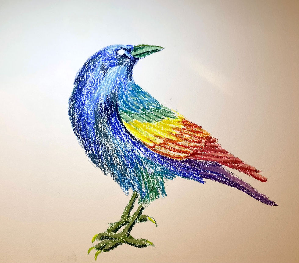
For the first layer, I blocked out values and put down colors that I could then layer on top of to create the feathered effect.
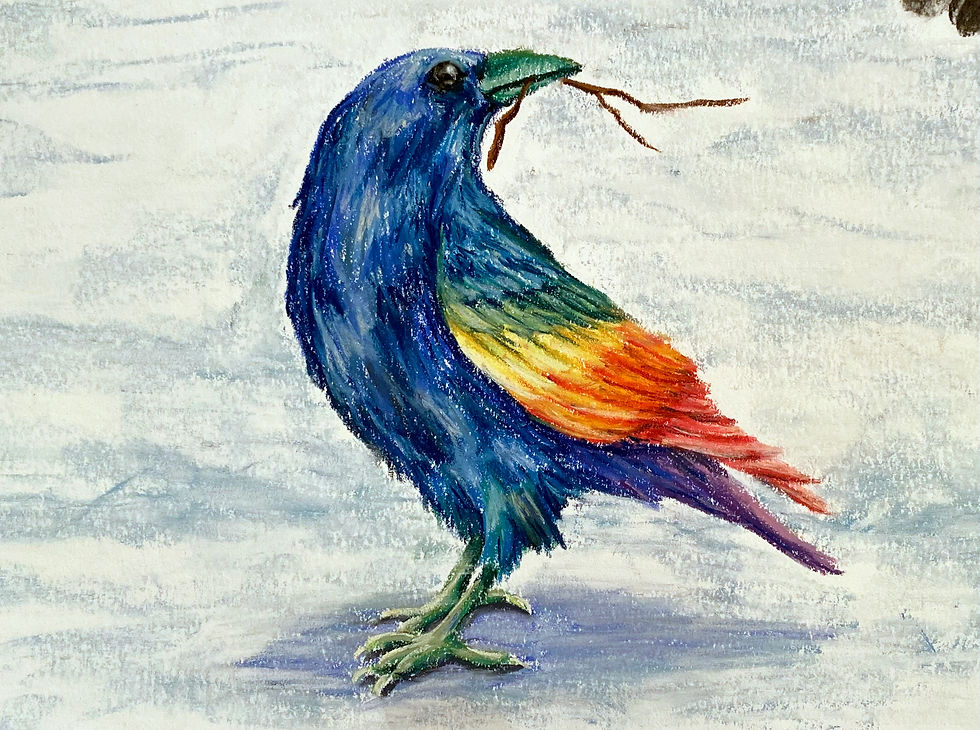
This is how the chalk pastel project turned out in the end, and I created the ground also using chalk pastels (I used medium blue, light blue, and white chalk pastels).

This is the combined image for dry media.
One written version of the story:
Long ago, Before the two-legged walked the Earth, all the animals lived in peace. They had enough to eat, and they never had to worry about the weather, because it never grew cold. Everything was perfect. The most beautiful of all the creatures was Rainbow Crow. He had feathers of all the colors on Earth and even some that were not on Earth: colors that we could not identify. He also had the loveliest voice. He filled the Earth with his heavenly music, and all the animals loved him and held him in high esteem. Yet, he was not proud, nor did he think himself better than the other animals.
One day, though, things changed. It grew colder, and the sky began to let down small flakes of white. The animals, seeing snow for the first time, were surprised but not afraid. They thought it was beautiful and new. It was only when the smallest of the animals, Mouse, became covered that they grew wary. 'It shall stop soon, surely,' they told one another. But it didn't stop. The smaller animals began to get covered by the snow. Squirrel and Mink were soon covered. Yet the snow continued to fall. They grew ever more afraid. When the very tips of Rabbit's ears were covered, the animals lost hope in the snow ever stopping. They gathered together and began to think of ideas to help them. Yet none could agree on what they should do, so they howled and screeched and barked, making a huge ruckus. Gopher and Porcupine were soon covered. This only frightened the animals more, and the noise grew.
Rainbow Crow, in his far-off perch, heard their cries and came swooping down to their aid. 'My friends,' he sang in his musical voice, 'what is the cause of your distress?'
All the animals were overjoyed that their beloved friend was there. 'The white flakes are covering us! Surely, if this persists much longer, we will all be covered and die! See, all the smaller ones are already buried!'
Rainbow Crow soothed their cries. 'I will help you in any way that I can.' He promised. 'What would you have me do?'
'Please,' they begged him, 'be our messenger to the Sky Spirit and ask him to take away this cold, or we will die!'
Rainbow Crow instantly flew off to the Sky Spirit to save his friends.
It took Rainbow Crow three days of constant flight before he reached the Sky Spirit. His wings ached, but he was filled with happiness that gave him strength. 'My mission is almost done,' he thought to himself. He gazed upon the majesty of the Sky Spirit with awe and respect. 'Please, great Sky Spirit,' he begged, 'please take away the snow. It is burying my friends! I have been sent here to plead for your help.'
The Sky Spirit gazed upon the beautiful bird with a sweet voice. 'I am sorry,' he replied, 'but I cannot stop the snow. The Wind Spirit is the one blowing cold air and freezing the sky. I cannot have him stop. However, I will give you fire. Bring this to your friends.' The great spirit took a stick and set it aflame from the sun. Rainbow Crow thanked him and, with the stick firmly secured in his beak, set off to return to Earth. He flew even though his wings were exhausted, and the stick slowly burned shorter.
On the first day, the smoke and ash blurred his vision and tainted his beautiful rainbow feathers. The stick burned shorter, and he wished to throw it away and save his feathers, but the remainder of his friends in peril made him continue. On the second day, the stick was even shorter. His feathers were now entirely dull. The smoke began to enter his throat, and he coughed and coughed. He wanted so badly to drop the stick, for his throat was becoming sore and dry. Yet the thought of all the animals in trouble spurred him onward. On the third day, the stick was no more than a stub. The flames and smoke poured down his throat and burned. He was in much pain and only wished he could throw the stick away. 'Even if I die,' he thought to himself, 'I must see this through. My friends count on me.' At last, he saw land.
All of the Earth was covered in snow, and not even the tips of Elk's antlers were visible. He slowly flew close over the snow, the flame in his beak melting it away. First, Elk and Horse reappeared. Soon after, Wolf and Fox, followed by Rabbit and soon even Squirrel, until finally Mouse was free and all the animals were uncovered. They rejoiced in finally being free and thanked the Rainbow Crow, but when he opened his mouth to speak, no beautiful melodies came forth: only a hoarse and rough 'caw.' The animals were shocked and horrified at the bedraggled black bird with the awful voice before them. How could Rainbow Crow become so ugly? All the animals left without another word, and Rainbow crow was left alone.
He flew his tired wings to his nest and collapsed into sobs. All he had been was now gone, and the animals thought he was ugly. It hurt him very much that those he had saved treated him so. Still, he would have done it again, even though he lost all his feathers. If it were to protect them, he would do anything.
The Sky Spirit heard the crow's weeping and came down from the sky. He had seen the treatment Rainbow Crow received and had come to comfort him. 'Do not weep, Rainbow Crow,' he whispered in a soothing voice. 'You have been rewarded for your actions, though it may not seem so.'
Rainbow Crow looked up curiously.
'Because you were so filling to do anything to save your friends, I have left you with a gift: survival. Soon the two legged will walk the Earth. They will kill many animals for their food or clothes, but you, they shall leave free. They will not capture you for your song because your lovely voice is gone. They will not kill you for your meat because you will taste like smoke and ash. They will not kill you for your feathers because what was once a beautiful rainbow is a dull black. I am sure a kind bird such as yourself would rather die for your friends than see them hunted, but you must live. Your sacrifice has shown you worthy. See, not all your beauty is lost.'
Rainbow Crow gazed closely at his coal-black feathers and gasped. There, among the black, was hidden bits of color. In his once beautiful feathers, a million tiny rainbows shone forth. Rainbow Crow smiled. He was content.
Over All Thoughts and Reflections on Dry Media:
When reflecting on my experimentation with all the supplies we have explored so far, the first thing that comes to mind is just how different all those materials are from one another despite all belonging to the category of dry drawing media. Graphite is a predictable medium. While not completely smooth, it lacks some of the roughness of other mediums. The firm quality of the material, combined with its controllable nature, lends itself to detail-oriented work. Meanwhile, despite charcoal being another monotone material, it has surprisingly different qualities than graphite. For instance, charcoal can cover much more area in a quicker manner than graphite because it has a much softer quality. Various forms of charcoal, such as vine or willow, are easily breakable, which can transfer to how the marks created from this material also hold a surprisingly delicate quality, easily smudged or accidentally blown away. However, charcoal also creates rough lines, especially on textured paper, where it only covers the top of the recessed surface, leaving hints of the paper peeking through. While this can be easily covered up with a blending stump, this roughness and unpredictability give the medium an expressive quality. Despite these differences, both monotone mediums share the fact that they lack color. This gives works created with the mediums an older feeling, reminding me of old photographs or some of the drawings made by the Masters.
Colored pencils reminded me a lot of graphite, one of the only differences was the variety of colors it came in. Yet, I was quick to learn that these two mediums do not mix well together. It wasn’t until this experiment that I was really able to see the shivery shiny quality of graphite that colored pencils lacked. Instead, colored pencils were bold and glossy. I was also surprised to reflect on how hard it was to erase colored pencils compared to graphite. Once a color had been put down, unless it was with an extremely light hand, a trace of that color would stain the paper. While colored pencils were precise and controllable, chalk and oil pastels could be described as the colorful cousins of charcoal. Both are loose, textured, and expressive like charcoal. However, chalk pastels were powdery and mixed together very easily to form a wide variety of new colors. Meanwhile, oil pastels were buttery and liquid smooth. While they still created a textured effect on most papers, especially though with a bit of tooth, they didn’t blend as well together as chalk pastels did. One thing I found to work exceptionally well was using toned paper with colored materials. This allowed the material, especially the pastels, the room to be more expressive with marks that didn’t have to be overworked to cover up the pristine white paper showing through the textured marks. Despite sharing qualities, each of these mediums was unique, with colored pencils feeling very purposeful and precise, chalk pastels containing a hazy, dreamlike quality, and oil pastels smooth and distinct.
Lastly, when considering working with limited colors compared to endless options, I was reminded of my high school IB art class. In that class, we were given complete artistic freedom as we were expected to come up with project ideas, decide what materials to use, and then complete it within a month. While it was initially exhilarating to do whatever I wanted, I quickly discovered how paralyzing that type of freedom could be. With so many options and possibilities to choose from, I had a tough time getting started and completing many of my projects. I realized that while it could seem stifling to have a project’s guidelines predetermined, I never really minded when they had been designed to allow for multiple interpretations. I found that these restrictions provided me a starting place that I could then work my way out of in some new direction. This revelation has shaped my own thoughts about being presented with a limited color pallet. I believe doing this will push students to explore in more depth what they can create within these boundaries, perhaps discovering something they wouldn’t have otherwise. As Hafeli (2015) states in Exploring Studio Materials, when students “are presented with too many options at once, or multiple materials that they haven’t encountered before, students are less likely to sustain in-depth exploration in any one of them” (28). By limiting the scope of what students have to choose to use, they are forced to focus on other aspects, such as what they can create with the colors they are given or how light and shadow are at play in their image.


Comments