Wet Materials 2: Acrylic and Gouache
- Caroline Harding

- Nov 16, 2023
- 11 min read
Acrylic

Adjectives
Liquid, opaque, bright, thick, flowing, permanent, colorful, mixable, changeable, fast
Supporting materials :
Water cups
Brushes
Paper towels
Sink and soap to wash hands and brushes
Pallets
Pallet knife
Apron
Spray bottle
Acrylic Mediums
Acrylic paint pens
Acrylic spray paints
Canvases or paper
Gesso
Different brands and types:
Golden Heavy Body Artist Acrylic Paints and Sets https://www.dickblick.com/products/golden-heavy-body-artist-acrylics/
Liquitex Basics Acrylic Paints and Set https://www.dickblick.com/products/liquitex-basics-acrylic-colors/
Blickrylic Student Acrylic Paints and Sets https://www.dickblick.com/products/blickrylic-student-acrylics/
Golden Open Acrylic Paints and Sets https://www.dickblick.com/products/golden-open-acrylics/
Golden High Flow Acrylic Paints and Sets https://www.dickblick.com/products/golden-high-flow-acrylics/
Chroma Acrylic Mural Paint https://www.dickblick.com/products/chroma-acrylic-mural-paint/
Plaid FolkArt Matte Acrylic Paints and Sets https://www.dickblick.com/products/plaid-folkart-matte-acrylic-paints/
Liquitex Professional Soft Body Acrylic Paints and Sets https://www.dickblick.com/products/liquitex-professional-soft-body-acrylics/?fromSearch=%2Fsearch%2F%3Fsearchword%3Dacrylic%20spray%20paint%20liquitex
Liquitex Professional Spray Paint https://www.dickblick.com/products/liquitex-professional-spray-paint/?fromSearch=%2Fsearch%2F%3Fsearchword%3Dacrylic%20spray%20paint%20liquitex
Uni Posca Paint Markers and Sets https://www.dickblick.com/products/uni-posca-paint-markers/?fromSearch=%2Fsearch%2F%3Fsearchword%3Dposco%20paint%20pens
Experimentation

Notes:
For this study, I used my golden acrylic paints along with Liquitex soft body acrylic paint and their spray paint. I am very familiar with acrylic paint, which helped me know what I should test out. This medium can be thinned out with water or mediums to make it more liquidy. Alternatively, you can utilize the thick nature of heavy body paint to create 3-D-like elements in a painting. This medium blends together very nicely and can also laver to create different effects. Some of the paints are opaquer than others which you can check by looking at the transparency level on the label. When blending and creating texture, you can either blend wet on wet to create a smooth transition or do it wet on dry to create a rough transition. you can also use other tools to make marks beyond the brush, such as a pallet knife.
Other examples:

This is a painting I created in high school in the style of Claude Monet that captured the view of a river that I drove past sometimes when I was going to soccer practice. This is an example of how acrylic paint can be used to capture an environment.
Safety/health considerations
Acrylic paints are water-based, which makes them a lot safer than oil paints. However, certain colors may still contain toxic chemicals such as cobalt, manganese, cadmium, chromium, and lead. For this reason, it is important to check the specific data safety sheet for the specific brand and color before using it. This is more common in professional acrylic brands, but even these brands will have alternative hues that are similar and do not contain these toxins. Another safety consideration is to provide adequate ventilation when using acrylic paints, as they will release small amounts of ammonia while drying. Finally, careful supervision of younger children, if they are working with the medium, should be done to ensure they do not ingest the paint.
Data safety sheet for Golden Acrylic paints: https://www.jerrysartarama.com/media/pdfs/golden/GOLDEN%20SDS%20Sheet%20Heavy%20Body%20Acrylics%20MSDS.pdf
Project ideas
Anything but a brush painting

This image is a painting that I created in high school, only using a pallet knife.
The objective of this project is to create a painting using anything except a brush. Students can create work using traditional materials like pallet knives or go more nontraditional by using things like their fingers, bubble wrap, or leaves. The subject of the painting is up to the student to choose.
Accommodation possibilities
Adaptive big/easy grip brushes for students working on their grip strength and fine motor skills
Gloves for students with sensory issues
Some ways of painting can be done with fingers, q-tips, and other materials that may be easier for some students to use
Appropriate age group and behavioral expectations
Acrylic paint is a very versatile medium that can be used with a wide arrange of students. Personally, I would hold off on introducing acrylic paint to younger students until I feel like they are developmentally ready to handle the medium. This is because the medium is harder to wash off things such as clothes or furniture, and it is generally more expensive. However, it is a higher quality paint with more pigment, so it would be good to give it to older students to let them create art with. So once younger elementary students have mastered tempura paint, or once they reach middle school, I would introduce acrylic paint to them.
Artist resources
Mark Rothko
Mark Rothko was a Latvian-American abstract painter. He is best known for his color field paintings that depicted irregular and painterly rectangular regions of color, which he produced from 1949 to 1970. Although Rothko did not personally subscribe to any one school, he is associated with the American Abstract Expressionist movement of modern art. Originally emigrating to Portland, Oregon, from Russia with his family, Rothko later moved to New York City, where his youthful period of artistic production dealt primarily with urban scenery. In response to World War II, Rothko's art entered a transitional phase during the 1940s, where he experimented with mythological themes and Surrealism to express tragedy. Toward the end of the decade, Rothko painted canvases with regions of pure color which he further abstracted into rectangular color forms, the idiom he would use for the rest of his life.

“White Center (Yellow, Pink and Lavender on Rose),” by Mark Rothko, 1950. Oil and acrylic with powdered pigments on canvas, 81.0 in × 56 in.
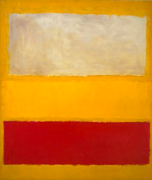
“No. 13 (White, Red on Yellow),” by Mark Rothko, 1958. Oil and acrylic with powdered pigments on canvas, 95-1/4 × 81-3/8 x 1-3/8 in.
Roy Lichtenstein
Roy Lichtenstein was an American pop artist. During the 1960s, along with Andy Warhol, Jasper Johns, and James Rosenquist, among others, he became a leading figure in the new art movement. His work defined the premise of pop art through parody. Inspired by the comic strip, Lichtenstein produced precise compositions that documented while they parodied, often in a tongue-in-cheek manner. His work was influenced by popular advertising and the comic book style. His artwork was considered to be "disruptive." He described pop art as "not 'American' painting but actually industrial painting."

“Drowning Girl,” by Roy Lichtenstein, 1963. Oil and acrylic paint on canvas, 67 5/8 x 66 ¾ in

“In the Car,” by Roy Lichtenstein, 1963. Oil and acrylic paint on canvas, 67.7 x 80.1 in.
Gouache

Adjectives
opaque, flat, watery, loose, changeable, colorful, designer, stubborn
Supporting materials :
Water cups
Brushes
Paper towels
Sink and soap to wash hands and brushes
Pallets
Apron
Spray bottle
Watercolor paper (hot or cold press)
Different brands and types:
Winsor & Newton Designers Gouache https://www.dickblick.com/products/winsor-newton-designers-gouache/
Liquitex Professional Acrylic Gouache and Sets https://www.dickblick.com/products/liquitex-professional-acrylic-gouache/
Caran d'Ache Gouache Studio Tubes and Sets https://www.dickblick.com/products/caran-dache-gouache-studio-sets/
Pelikan Gouache Pan Sets https://www.dickblick.com/products/pelikan-gouache-pan-sets/
Experimentation
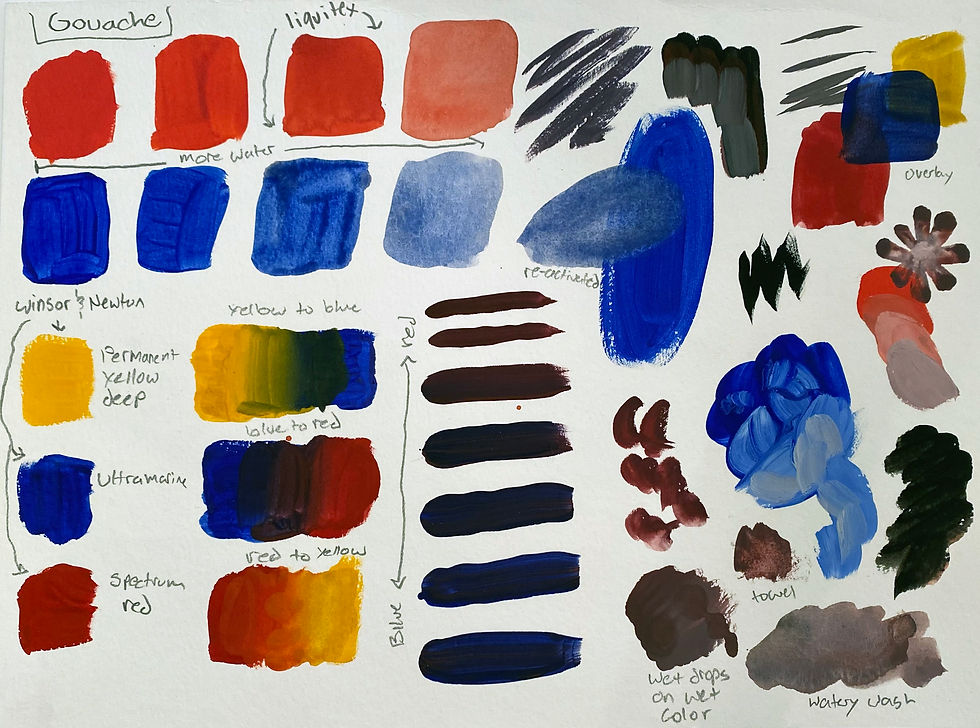
Notes:
This material is both very similar to watercolor and acrylic paint. It is like watercolor because it is water activated and can be watered down significantly without degrading in quality. Additionally, it can be reactivated once it is dried by using water. However, it is also like acrylic because it is an opaquer paint that opaques in a similar manner. The material tends not to want to mix with itself once it is put on paper to make gradients. Overall, it likes to stick to flat, consistent colors. I traditionally don't use gouache in practice, but I love the graphic look of the medium, and I want to keep exploring it.
Safety/health considerations
Like watercolors, gouache is safe to use without ventilation, even though a small amount of formaldehyde may evaporate while wet. Some professional grade gouaches do contain unsafe ingredients like cadmium, cobalt, and gum Arabic, which should be avoided. There are usually substitute hues for those paints which should be utilized to prevent exposing students to dangerous chemicals.
Data safety sheet for Winsor & Newton Designers Gouache: https://media.jacksonsart.com/pdf/sds_Winsor_Newton_Designers_Gouache.pdf
Project ideas
Create a design

This image is a graphic flat color image I designed recently.
The objective for this project would be to create a design only using flat colors (no gradients or color transitions). In this project, students will be challenged to create a design that isn’t too complex or simple while also looking at different values. This project could also serve as a good transition into thinking about digital art.
Accommodation possibilities :
Adaptive big/easy grip brushes for students working on their grip strength and fine motor skills
Gloves for students with sensory issues
Some ways of painting can be done with fingers, q-tips, and other materials that may be easier for some students to use
Appropriate age group and behavioral expectations
Gouache is something that I would wait to introduce to students until they are slightly more advanced or older. While I don't think that the medium is harmful to younger students to experiment with, it can be rather expensive, and it would be better for younger students to get familiar with watercolor and other forms of paint, such as tempera or acrylic, first.
Artist resources
Egon Schiele
Egon Schiele was an Austrian Expressionist painter. His work is noted for its intensity and the many self-portraits the artist produced, including nude self-portraits. The twisted body shapes and the expressive line that characterize Schiele's paintings and drawings mark the artist as an early exponent of Expressionism. Gustav Klimt, a figurative painter of the early 20th century, was a mentor to Schiele.

“Self-Portrait with Hands on Chest (Egon Schiele),” by Egon Schiele, 1910. Watercolor, gouache, and charcoal on paper, 17.6 x 12.3 in.
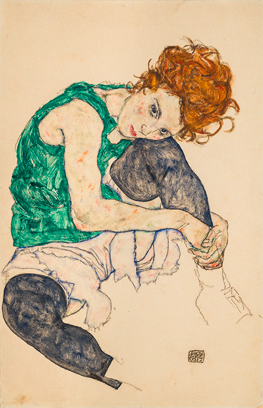
“Seated Woman with Bent Knees,” by Egon Schiele, 1917. Gouache, watercolor, and black crayon on paper, 18 in × 12 in.
Claire-Chine Hardion
Claire-Chine Hardion has worked as a Freelance Designer in Jewelry and High Jewelry since 2015. She studied at the Parisian School BJOP, where she graduated with a Master's degree in Design. Hardion currently works for notorious Jewelry Houses, in France and abroad. As a little girl, Hardions childhood was nourished by her Mexican and Spanish roots. A colored universe filled with vibrant bouquets in huge vases. A beautiful nature, teeming with life and legends. All of her designs are inspired by these beloved memories, a fondness for the legacy of the Luxury professions, and the History of Jewelry.

"Anita necklace," design and gouache by Claire-Chine Hardion.
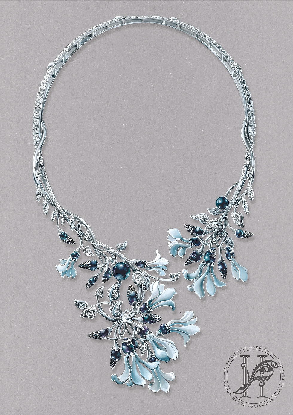
"Cyclamens necklace," design and gouache by Claire-Chine Hardion.
Projects:
For my personal project exploring how different birds have different symbolic meanings in different cultures, I chose to explore how pigeons are viewed in large population cities, such as New York. I have often heard these birds being referred to as "rats with wings," and the common consensus is that they are looked down on as pests. I wanted to capture how these birds are viewed in the culture by creating a couple of paintings of pigeons on a piece of trash cardboard.

This is my first primary sketch of the three birds on some scraps of cardboard I found.

This is an image of the pigeons after I gessoed their designs on the cardboard before I started painting.

To create these paintings, I started with flat colors blocking out values and hues, and the I went in with different values to create dimension.

This is the final picture of the three musketeer trash pigeons I painted for this project. I decided not to change the shape of the cardboard pieces or cut them down closer to the painting to really highlight the cardboard and what it symbolizes.

This is what my pallet looked like when I finished the painting.
Overall thoughts and reflections on Wet Media:
Throughout my artistic career, I have always found myself returning to painting. Ever since I was little, I have gravitated toward the fluid movement of paints and the expressive and vibrant colors they afforded me. Painting is my home, a foundation that I have used to help guide me through my exploration of other mediums. Above all else, the one thing I love about fluid mediums is that no matter how much I think I know about them, the mediums never fail to surprise me with interesting new combinations and techniques. Whenever I pick up a paintbrush, I always walk away with a new understanding.
The main difference between watercolor and many other wet media materials like acrylic is that it can be reactivated after it dries. If you were to take any old watercolor painting and add a little water, you could easily change the image. This ability of watercolor adds to its semi-permanent status because while it is possible to reactivate the medium by picking up or moving pigment on the paper, it is also close to impossible to completely remove the memory of what has been put down before. Watercolor is a very time-consuming medium that demands patience. Layering is key to this media and giving it time to build and dry is essential instead of rushing through the process. It is extremely easy to overwork aspects, and once that happens, removing what has been put down is difficult because the pigment tends to stain the paper. Furthermore, the more you try to water it down, the more you risk ruining the paper. Watercolor’s loose and flowing appearance lends itself to the medium’s spontaneity as no one ever truly knows what it will look like until it settles and dries. The thin liquid body of the medium also makes it extremely important to consider what paper you want to use before creating an image. Cold press paper’s rough, bumpy texture will shine through, while using hot press paper’s smooth silk will make a soft final work.
Before this class, I had never used tempera paint before, or if I had, which I suspect to be true in my younger years, I had no memory of it specifically. I usually associate temperate paint with a lower quality paint used for little kids, so I was surprised to learn about its rich history. Mary Hafeli (2015) explains in Exploring Studio Materials, “The oldest form of tempura – made with egg to suspend and bind the paint’s ground pigment – predates oil paint as an artists’ medium and was used widely by artists in the Middle Ages” (p. 75). While this paint reminded me of acrylic paint, it was much more liquid and waterier than I was used to. Using this material on a piece of black construction paper really highlighted to me just how transparent the medium was compared to the heavy body acrylic paints I was familiar with. To get a consistent opaque coverage, each section needed a couple of layers. However, one thing that is good to know about this medium is that it is relatively easy to clean up. I found this extremely helpful while helping out and observing Saturday Studio with the Art Adventures class using tempera paint. The medium gave itself wonderfully to the younger students using it. Additionally, all I needed was a little water to clean up any spills.
I have always associated gouache with watercolor, so I was surprised to work with it alongside acrylic instead of watercolor during class. This medium is similar to watercolor in that it can reactivate with water after it has dried, and its thin consistency reflects the surface of the paper. However, it doesn’t act like watercolor on paper. Instead of the transparent water effect of watercolor, gouache has more of an acrylic effect with flat, uniform colors. Constancy is a keyword that pops up when I think about this medium. Blending colors is different with gouache than many of the other mediums I have explored so far. The colors don’t mix and blend well together when placed on paper. Instead, colors are mixed in advance on a pallet before putting down on paper. Many artists who used gouache create volume in their work by shading using a graphic cell technique or layering different colors close together to create the illusion of a smooth transition. Gouache has a pop that watercolor lacks, a type of physicality given by its opaque nature. Despite this, both mediums are friends and can be mixed to create beautiful works of art.
Acrylic paint has been my go-to medium all through middle and high school. The fluidity and expressive nature of the medium as always called me. I love how I can create layers of color and easily mix new complex hues that bring about different connotations. As a novice artist, I was often scared to use mediums like ink and watercolor because I knew that I would make mistakes in things like perspective and proportion and be unable to undo what I had done. However, with painting, I was free to take risks and work through these challenges. I could always paint over a section and change the images if I didn’t like an area. Surprisingly, I have learned that acrylic paint is both permeant and not at the same time in terms of its ability to cover up. This medium has versatility; you can thin it out to create smooth, transparent effects or layer it on thick, creating exciting textures within a painting. Additionally, unlike other bodies of paint, such as oil, acrylic dries relatively fast, allowing the artist to move quickly when creating works. I learned from Tony Zatzik’s demonstration that there are mediums specifically able to be used with acrylic paint that help thin it out and make it more transparent while keeping the quality of the paint stable in a way that can’t be achieved with only water. I was excited to explore this technique in my work because I could achieve more of the glowing effect I love in oil paint. Ultimately, this medium is very forgiving and excellent for more advanced students.


Comments