Cute and Creepy Clay Study
- Caroline Harding

- Apr 24, 2023
- 9 min read
Updated: Oct 30, 2024
Intro:
To start this project, we were tasked with bringing some toys to class. We were then split into groups of about 6-8 people each. In each group, we laid out all our toys in front of a long piece of paper with cute written on one side and creepy on the other. We were then tasked with sorting all our toys on this cute and creepy spectrum. While sorting through all our toys, we started to draw some conclusions about why we thought some toys were cute and others were creepy.

For example, one of our main focuses was the eye of each creature. We felt that toys with big, bright, and friendly eyes were cute, while those with small, dark, and piercing eyes were as creepy. We also noticed that including a white highlight or sparker in the eye did a lot to make a toy seem cuter. Additionally, other aspects we considered were the size, color, texture, and visual connotations. We noticed that smaller toys with soft features and pastel colors might be perceived as cute, while larger toys with sharp edges and darker colors might be seen as more menacing or creepy. Soft textures, pastel colors, small objects, and rounded shapes are often associated with cuteness and innocence. In contrast, dark colors, sharp edges, larger shapes, and rough textures can be seen as more menacing or creepy. Toys that resemble babies, such as baby dolls or plushies with pacifiers, may also be perceived as cute. Meanwhile, toys with exaggerated or distorted baby features, such as oversized heads or unnaturally large eyes, may be seen as creepy.
While doing this activity, I noticed how toys geared towards boys were either placed in the neutral category or towards the creepy spectrum, but not on the cute side. Meanwhile, all the toys that we considered to be very cute would be traditionally classified as girl toys. This makes me think of how gender is inherently in play when thinking about the idea of cute and creepy. Overall, sorting toys based on their cuteness or creepiness can be a fun and illuminating exercise highlighting the complex ways we perceive and respond to different visual stimuli.
Prompt:
“Too often art teachers try to banish the cute and the creepy. We embrace Cute and Creepy because we recognize them as meaning making positions that can aid students in making art that represents and deconstructs the construction of personal experience.”
Did you ever imagine yourself as an appliance, animal, or food item? Were you cute?
Or have you ever had an experience where you thought, “Wow, that was creepy”? Where
any creatures or objects involved in that moment that you suddenly found uncanny?
Using clay, create a 3D object that represents your exploration on cute and creepy.
Consider sketching the object on paper then transfer it to a 3D form.

For this assignment, I decided to try to figure out if any animal could represent me, which one would it be. When brainstorming, I created a list of my favorite animals which included red wolves, dogs, blue jays, snow leopards, black cats, and seals. Looking at my options, I was drawn toward seals and wondered how they might represent me. My appreciation of seals comes back to my Danish identity. Whenever I visited my grandparents' house in Denmark, I often saw these majestic creatures swimming in the nearby waters. I remember that we used to ride the fairy to the other side of the fjord to go to a pier full of them to watch them swim away into the water when we got too close. To me, the seal represents a connection to my family's roots and the natural beauty of Denmark's coastal regions. Given this, I decided to create a seal for this assignment, specifically a harbor seal, the subtype I'm used to seeing in Denmark.
Materials/Process:

For this assignment, we explored air dry clay. While I am sure I used this material when I was younger, I had no memory of ever playing with air dry clay before, so I was excited to see the differences between this and ceramic stoneware clay. One of the things I was very surprised by was how much the clay felt like regular ceramic stoneware. Other than being a little stickier and lighter than I expected, I was able to treat this project very similarly to any other clay sculpture I have created.

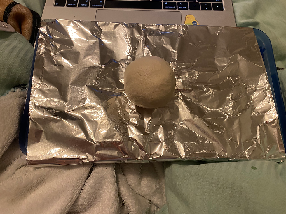

I started by creating large general shapes of the seal and then refining them as I went along. I found it really helpful to use some of the wooden tools to help shape and smooth out the clay into my desired shape.

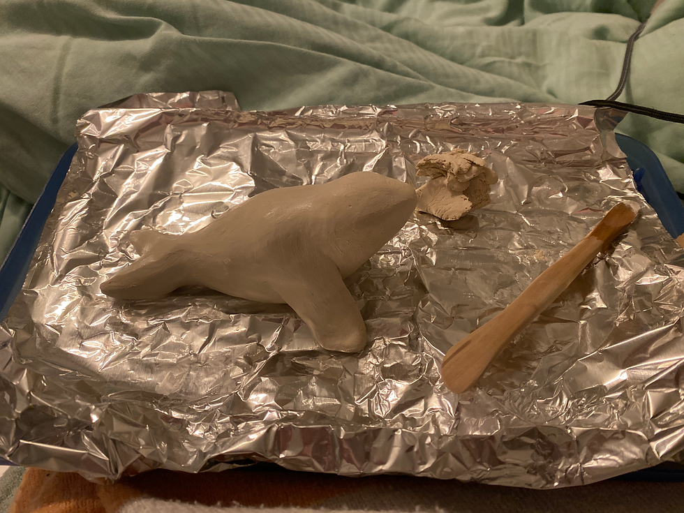
After I was happy with the general body shape, I made and attached flippers to the torso. I waited to do this because I knew they would be very delicate and easy to break off. When attaching different clay pieces, you traditionally want to slip and score the two parts to chemically bond them together and prevent them from separating when the clay is dried and fired. However, since this is air-dry clay, I decided to forgo scoring and just attached the two pieces with some water because I didn’t need to worry about them coming apart in the kiln.
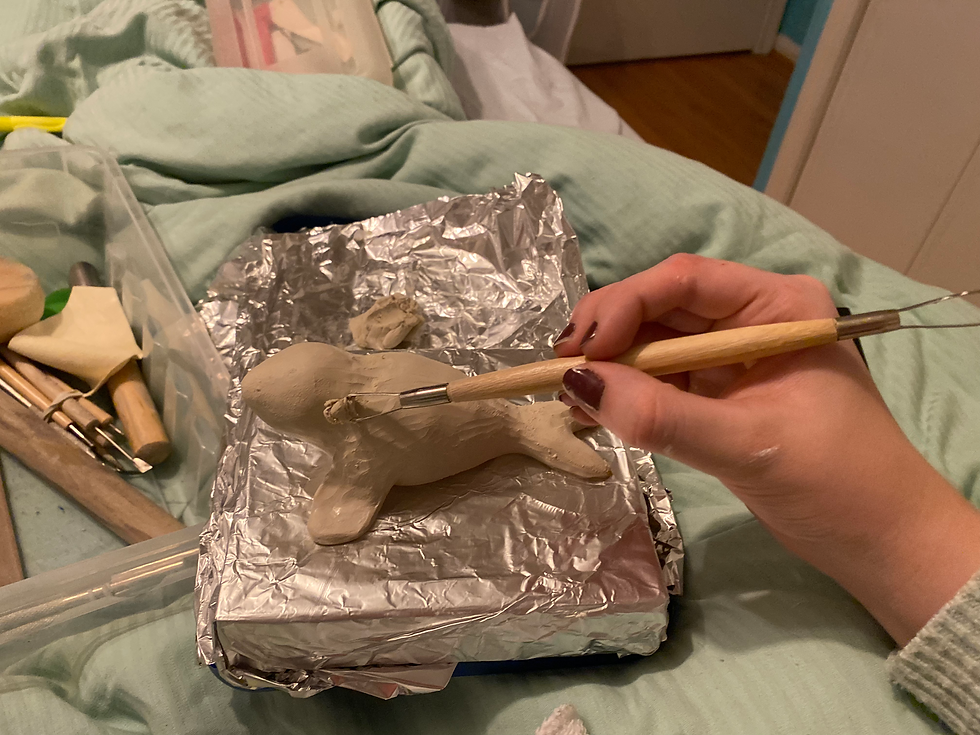
I also utilized some of the carving tools I had available to help remove excess clay and refine the overall shape of my seal. This worked better than using my fingers to remove or redistribute the excess.


By the time I finished sculpting my seal, I was happy with the overall shape I achieved and let it sit out to air dry for a week before I did anything to decorate it. At one point, I bumped into one of the flippers, which broke off. Luckily, I found that the clay could be easily reactivated with water, allowing me to attach the flipper back on with minimal difficulty. However, there was a downside to this aspect of the clay because it made it difficult to paint with a water-based medium like acrylic without reactivating the clay. To counter this, I ended up putting down a quick layer of gesso on the seal to create a waterproof layer I could then blend colors on top of.


This is what my seal finally ended up looking like after I finished painting and applied a top protective coat to it. I am really proud of how much my final image looks like the sketch I created. For this project, I tried to lean into making something cute, and I think I succeeded in many aspects by trying to follow the guidelines we group came up with by sorting our toys by cute and creepy. I do think that some aspects of my seal may fall more on the creepy side than cute, but I like some of the ambiguity that this duality gives my piece. I also wonder if it is truly possible to make something that is 100% cute or 100% creepy.
Artist Examples:

"Possessed" by Audrey Kawasaki. 24 x 28 in. Oil, acrylic, and graphite on wood panel. 2012.
Audrey Kawasaki, born in Los Angeles in 1982, is a contemporary artist known for her hauntingly beautiful paintings, characterized by a unique blend of delicate linework, subdued colors, and ethereal figures. Kawasaki's work often features cut or fragmented figures, adding an unsettling element to her otherwise dreamy and serene compositions. The uncanny atmosphere she creates, coupled with the suggestion of violence or dismemberment, lends a subtly creepy quality to her art.
Website: https://www.audkawa.com/

“Venom Collector” by Camille Rose Garcia. 48 × 36 in. Acrylic and glitter on wood panel with Pacific Ocean forged driftwood. 2021.
Camille Rose Garcia is an American painter and illustrator whose work is characterized by a bold, graphic style that draws inspiration from fairy tales, folktales, and popular culture. Born in Los Angeles in 1970, Garcia received her education at the Otis College of Art and Design and has since exhibited her work in galleries around the world. Her art often features a cast of creepy and fantastical characters, whose twisted and fragmented forms are suggestive of a darker, more sinister undercurrent. The use of cut or fractured imagery is a recurring motif in her work, further adding to the sense of unease and disorientation that pervades her art.
Website: https://www.camillerosegarcia.com/

"Moss Boy and Girl with Two Headed Rabbit" by Kim Simonsson. 33 1/2 in. Stoneware, Nylon Fiber. 2020
Kim Simonsson is a Finnish ceramic sculptor whose work is known for its eerie and otherworldly quality. Born in 1974, Simonsson has gained international recognition for his distinctive use of glazed ceramics to create fantastical, moss-covered creatures that blur the line between reality and fantasy. His art often features figures with disproportionate or fragmented limbs, adding a surreal and unsettling element to her otherwise whimsical creations. This use of fragmentation and distortion creates a sense of the uncanny, leaving the viewer with a feeling of both fascination and unease.
Website: http://www.kimsimonsson.com

"Le Noble Savage" by Wangechi Mutu. 91 3/4 × 54 in. Ink and collage on Mylar. 2006.
Wangechi Mutu is a Kenyan-American artist whose work explores themes of gender, race, and colonialism through a surreal and often grotesque lens. Born in Nairobi in 1972, Mutu earned her MFA from Yale University and has since gained widespread acclaim for her striking collages, paintings, and sculptures. Her art often incorporates body horror and unsettling imagery, with distorted and fragmented figures that challenge conventional notions of beauty and the human form. This disturbing and often visceral quality creates a sense of unease, drawing the viewer into a complex and thought-provoking exploration of identity and power.
Possible lesson ideas:

Student example
The art lesson plan titled "Sewing Monsters" aims to teach students how to create mixed media monsters using fabric arts and sewing techniques while exploring how different design elements can contribute to a sense of cuteness or creepiness in characters. The goal of this lesson is to create a monster that falls on either side of the cute or creepy spectrum (or possibly somewhere in the middle). The materials required include fabric scraps, felt, thread, stuffing, scissors, sewing needles, pins, glue, and any additional decorations such as buttons or beads. Through this exercise, students will learn about the power of visual media in shaping our perceptions and attitudes towards different characters, and how these influences can affect our engagement with different forms of media. The lesson plan offers a fun and creative way for students to develop their design skills and explore the role of aesthetics in shaping our emotional responses.

JeongMee Yoon: The Pink and Blue Project
The art lesson plan aims to explore how gender roles are connected to the cute and creepy aesthetics. The lesson begins with a discussion of how society often associates certain colors, textures, and features with femininity or masculinity. Students are then asked to create their own objects or toys, either cute or creepy, using these features to reflect on how gender roles influence our perceptions of cuteness and creepiness. Through this exercise, students can learn about the ways in which gender roles are constructed and reinforced through visual media and aesthetics, and how these influences can affect our perceptions and attitudes towards different genders. The lesson plan offers a creative and engaging way for students to explore and challenge gender norms, and to develop a critical understanding of the ways in which aesthetics and gender intersect in our society.
General Reflections:
Over all I really enjoyed this project and found it a fun and challenging exercise. In terms of medium, I found that air dry clay is a very versatile and easy-to-use material that does not require a kiln or high-temperature firing like ceramic stoneware. This means that if a school does not have access to a kiln, students can still make 3-D clay sculptures. Additionally, I enjoyed how this medium lent itself to experiment with different forms and textures, which was helpful in creating the desired aesthetic of cute and creepy. Comparing air dry clay to ceramic stoneware, I would say that air dry clay is more suitable for beginners and those who do not have access to a kiln or other ceramic technology. Additionally, the use of air dry clay can provide students with a low-cost and accessible medium to work with, which could be especially helpful in schools with limited resources or for at-home learning. However, the benefits of ceramic stoneware are that it offers a more professional finish and the final glazed product is usually more sturdy and long lasting. As for teaching applications, the use of air dry clay in a lesson plan could be an effective way to introduce students to sculpting techniques and thinking in a 3-D space.
In terms of prompts, I believe that incorporating a discussion of cute and creepy in the art classroom can offer a meaningful way for students to explore and expand on what it means to be en artist. By embracing these aesthetics, art teachers can empower students to deconstruct and challenge societal constructions of cuteness and creepiness, ultimately leading to more nuanced and complex artistic expressions. I think that the prompt of cute and creepy can also be used to encourage students to think critically about the design elements that contribute to these aesthetics, such as color, texture, and shape. Overall,I found the "Cute and Creepy" was a valuable learning experience and demonstrated the potential of air dry clay in the classroom.


Comments